Turning Solar Complexity into Clear and Confident Energy Control
Turning Solar Complexity into Clear and Confident Energy Control
Turning Solar Complexity into Clear and Confident Energy Control

MY ROLE
UI Designer
UX Designer
MY ROLE
UI Designer
UX Designer
MY ROLE
UI Designer
UX Designer
DELIVERABLES
High Fidelity Designs
Component Library
DELIVERABLES
High Fidelity Designs
Component Library
DELIVERABLES
High Fidelity Designs
Component Library
TEAM
Design Team
Development Team
Project Manager
Client's Management
TEAM
Design Team
Development Team
Project Manager
Client's Management
TEAM
Design Team
Development Team
Project Manager
Client's Management
THE WHY
The project was created in response to an internal business need. Our product - the Green Energy Controller - collected detailed data on energy production and consumption, but users had no way of accessing this information or controlling circuits remotely. Providing such a tool was essential not only for improving the user experience, but also for keeping the product competitive in the market.

THE WHAT
The answer to this need was the creation of a dashboard - a tool that enables users to clearly visualize energy data and remotely control circuits.
THE WHAT
The answer to this need was the creation of a dashboard - a tool that enables users to clearly visualize energy data and remotely control circuits.
THE WHAT
The answer to this need was the creation of a dashboard - a tool that enables users to clearly visualize energy data and remotely control circuits.
THE HOW
We started the project with conversations with the business team to align on goals and make sure we shared the same picture of the challenge.
THE HOW
We started the project with conversations with the business team to align on goals and make sure we shared the same picture of the challenge.
THE HOW
We started the project with conversations with the business team to align on goals and make sure we shared the same picture of the challenge.
KEY INSIGHTS
Unclear savings
Users feel frustrated when they don’t see the promised benefits from their solar panel investment.
Lack of control
Decisions are often based on guesswork instead of clear data, which makes users uncertain about whether they are using their system to its full potential.
Tech barrier
Most users are not technical. They need a dashboard that speaks their language and is easy to understand, not packed with jargon.
Everyday cost pressure
With rising living expenses, users are actively looking for ways to cut costs and expect the product to help them achieve visible savings.
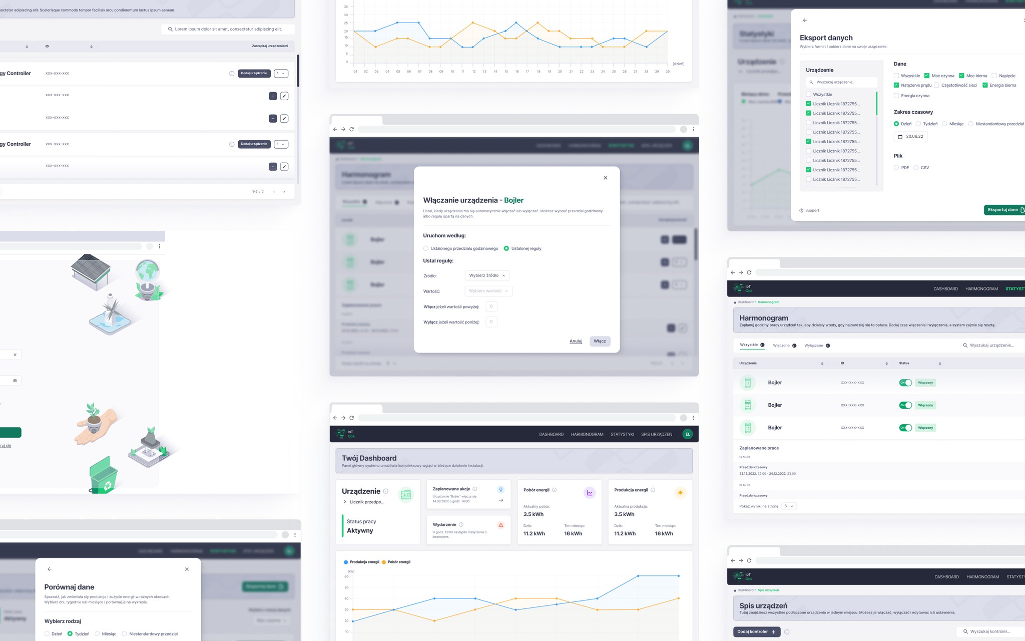
KEY FEATURES
Real-time monitoring
Clear view of how panels perform at any moment, reducing frustration from unclear results.
Historical analysis
Simple charts to spot usage patterns and compare periods.
Contextual tooltips
Explain complex data in plain language, turning numbers into actionable insights.
Device control & automation
Schedule or switch devices at the best times to optimize energy use.
UX DESIGN
Before jumping into visuals, we worked with the client and dev team to map user journeys and create wireframes. This helped us agree on the key flows and priorities, so everyone shared the same vision before moving forward.
UX DESIGN
Before jumping into visuals, we worked with the client and dev team to map user journeys and create wireframes. This helped us agree on the key flows and priorities, so everyone shared the same vision before moving forward.
UX DESIGN
Before jumping into visuals, we worked with the client and dev team to map user journeys and create wireframes. This helped us agree on the key flows and priorities, so everyone shared the same vision before moving forward.
UI DESIGN
When it came to the interface, we extended the client’s branding into a complete color palette and made sure everything followed WCAG guidelines. Together with developers we selected a UI kit that was efficient for implementation. Wherever the kit fell short, we designed custom icons and components to give the product its own character. The result was an interface that was consistent with the brand, accessible, developer-friendly, and centered on real user needs.

THE RESULT
Stakeholders expressed strong satisfaction with the dashboard, noting that it clearly communicated energy performance, aligned with business goals, and provided a solid foundation for future product improvements.
THE RESULT
Stakeholders expressed strong satisfaction with the dashboard, noting that it clearly communicated energy performance, aligned with business goals, and provided a solid foundation for future product improvements.
THE RESULT
Stakeholders expressed strong satisfaction with the dashboard, noting that it clearly communicated energy performance, aligned with business goals, and provided a solid foundation for future product improvements.
LEARNING
Abstract numbers aren’t enough
rules like “turn on above 0.5 kW” felt too technical. A better path would be suggesting ranges or even showing real savings over time, so users clearly see the impact of their choices.
UI kits matter
the right system should match project needs, not just provide generic components. A better fit could have saved us time and effort.
Small tips count
tooltips proved crucial in guiding non-technical users when plain language alone wasn’t enough.
KEY OUTCOME
The client acknowledged the dashboard’s value in enhancing the product’s strategic impact.